# Slots
This page assumes you've already read the Components Basics. Read that first if you are new to components.
# Slot Content
Vue implements a content distribution API inspired by the Web Components spec draft (opens new window), using the <slot> element to serve as distribution outlets for content.
This allows you to compose components like this:
<todo-button>
  Add todo
</todo-button>
2
3
Then in the template for <todo-button>, you might have:
<!-- todo-button component template -->
<button class="btn-primary">
  <slot></slot>
</button>
2
3
4
When the component renders, <slot></slot> will be replaced by "Add Todo".
<!-- rendered HTML -->
<button class="btn-primary">
  Add todo
</button>
2
3
4
Strings are just the beginning though! Slots can also contain any template code, including HTML:
<todo-button>
  <!-- Add a Font Awesome icon -->
  <i class="fas fa-plus"></i>
  Add todo
</todo-button>
2
3
4
5
Or even other components:
<todo-button>
  <!-- Use a component to add an icon -->
  <font-awesome-icon name="plus"></font-awesome-icon>
  Add todo
</todo-button>
2
3
4
5
If <todo-button>'s template did not contain a <slot> element, any content provided between its opening and closing tag would be discarded.
<!-- todo-button component template -->

<button class="btn-primary">
  Create a new item
</button>
2
3
4
5
<todo-button>
  <!-- Following text won't be rendered -->
  Add todo
</todo-button>
2
3
4
# Render Scope
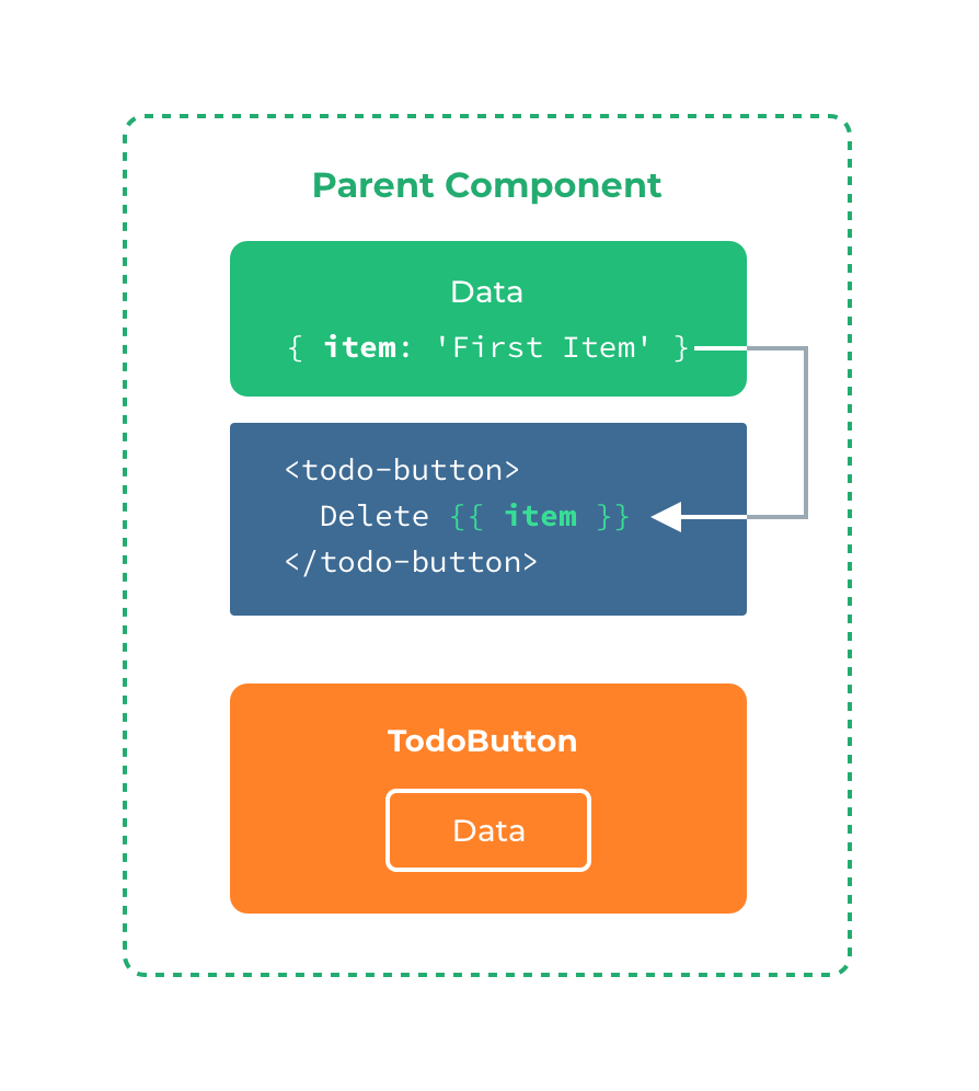
When you want to use data inside a slot, such as in:
<todo-button>
  Delete a {{ item.name }}
</todo-button>
2
3
That slot has access to the same instance properties (i.e. the same "scope") as the rest of the template.

The slot does not have access to <todo-button>'s scope. For example, trying to access action would not work:
<todo-button action="delete">
  Clicking here will {{ action }} an item
  <!--
  The `action` will be undefined, because this content is passed
  _to_ <todo-button>, rather than defined _inside_ the
  <todo-button> component.
  -->
</todo-button>
2
3
4
5
6
7
8
As a rule, remember that:
Everything in the parent template is compiled in parent scope; everything in the child template is compiled in the child scope.
# Fallback Content
There are cases when it's useful to specify fallback (i.e. default) content for a slot, to be rendered only when no content is provided. For example, in a <submit-button> component:
<button type="submit">
  <slot></slot>
</button>
2
3
We might want the text "Submit" to be rendered inside the <button> most of the time. To make "Submit" the fallback content, we can place it in between the <slot> tags:
<button type="submit">
  <slot>Submit</slot>
</button>
2
3
Now when we use <submit-button> in a parent component, providing no content for the slot:
<submit-button></submit-button>
will render the fallback content, "Submit":
<button type="submit">
  Submit
</button>
2
3
But if we provide content:
<submit-button>
  Save
</submit-button>
2
3
Then the provided content will be rendered instead:
<button type="submit">
  Save
</button>
2
3
# Named Slots
There are times when it's useful to have multiple slots. For example, in a <base-layout> component with the following template:
<div class="container">
  <header>
    <!-- We want header content here -->
  </header>
  <main>
    <!-- We want main content here -->
  </main>
  <footer>
    <!-- We want footer content here -->
  </footer>
</div>
2
3
4
5
6
7
8
9
10
11
For these cases, the <slot> element has a special attribute, name, which can be used to assign a unique ID to different slots so you can determine where content should be rendered:
<div class="container">
  <header>
    <slot name="header"></slot>
  </header>
  <main>
    <slot></slot>
  </main>
  <footer>
    <slot name="footer"></slot>
  </footer>
</div>
2
3
4
5
6
7
8
9
10
11
A <slot> outlet without name implicitly has the name "default".
To provide content to named slots, we need to use the v-slot directive on a <template> element, providing the name of the slot as v-slot's argument:
<base-layout>
  <template v-slot:header>
    <h1>Here might be a page title</h1>
  </template>

  <template v-slot:default>
    <p>A paragraph for the main content.</p>
    <p>And another one.</p>
  </template>

  <template v-slot:footer>
    <p>Here's some contact info</p>
  </template>
</base-layout>
2
3
4
5
6
7
8
9
10
11
12
13
14
Now everything inside the <template> elements will be passed to the corresponding slots.
The rendered HTML will be:
<div class="container">
  <header>
    <h1>Here might be a page title</h1>
  </header>
  <main>
    <p>A paragraph for the main content.</p>
    <p>And another one.</p>
  </main>
  <footer>
    <p>Here's some contact info</p>
  </footer>
</div>
2
3
4
5
6
7
8
9
10
11
12
Note that v-slot can only be added to a <template> (with one exception)
# Scoped Slots
Sometimes, it's useful for slot content to have access to data only available in the child component. It's a common case when a component is used to render an array of items, and we want to be able to customize the way each item is rendered.
For example, we have a component, containing a list of todo-items.
app.component('todo-list', {
  data() {
    return {
      items: ['Feed a cat', 'Buy milk']
    }
  },
  template: `
    <ul>
      <li v-for="(item, index) in items">
        {{ item }}
      </li>
    </ul>
  `
})
2
3
4
5
6
7
8
9
10
11
12
13
14
We might want to replace the {{ item }} with a <slot> to customize it on parent component:
<todo-list>
  <i class="fas fa-check"></i>
  <span class="green">{{ item }}</span>
</todo-list>
2
3
4
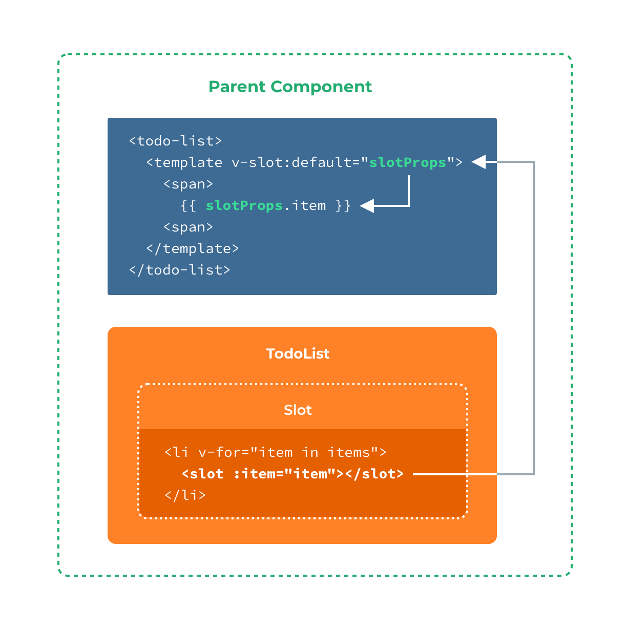
That won't work, however, because only the <todo-list> component has access to the item and we are providing the slot content from its parent.
To make item available to the slot content provided by the parent, we can add a <slot> element and bind it as an attribute:
<ul>
  <li v-for="( item, index ) in items">
    <slot :item="item"></slot>
  </li>
</ul>
2
3
4
5
You can bind as many attributes to the slot as you need:
<ul>
  <li v-for="( item, index ) in items">
    <slot :item="item" :index="index" :another-attribute="anotherAttribute"></slot>
  </li>
</ul>
2
3
4
5
Attributes bound to a <slot> element are called slot props. Now, in the parent scope, we can use v-slot with a value to define a name for the slot props we've been provided:
<todo-list>
  <template v-slot:default="slotProps">
    <i class="fas fa-check"></i>
    <span class="green">{{ slotProps.item }}</span>
  </template>
</todo-list>
2
3
4
5
6

In this example, we've chosen to name the object containing all our slot props slotProps, but you can use any name you like.
# Abbreviated Syntax for Lone Default Slots
In cases like above, when only the default slot is provided content, the component's tags can be used as the slot's template. This allows us to use v-slot directly on the component:
<todo-list v-slot:default="slotProps">
  <i class="fas fa-check"></i>
  <span class="green">{{ slotProps.item }}</span>
</todo-list>
2
3
4
This can be shortened even further. Just as non-specified content is assumed to be for the default slot, v-slot without an argument is assumed to refer to the default slot:
<todo-list v-slot="slotProps">
  <i class="fas fa-check"></i>
  <span class="green">{{ slotProps.item }}</span>
</todo-list>
2
3
4
Note that the abbreviated syntax for default slot cannot be mixed with named slots, as it would lead to scope ambiguity:
<!-- INVALID, will result in warning -->
<todo-list v-slot="slotProps">
  <i class="fas fa-check"></i>
  <span class="green">{{ slotProps.item }}</span>

  <template v-slot:other="otherSlotProps">
    slotProps is NOT available here
  </template>
</todo-list>
2
3
4
5
6
7
8
9
Whenever there are multiple slots, use the full <template> based syntax for all slots:
<todo-list>
  <template v-slot:default="slotProps">
    <i class="fas fa-check"></i>
    <span class="green">{{ slotProps.item }}</span>
  </template>

  <template v-slot:other="otherSlotProps">
    ...
  </template>
</todo-list>
2
3
4
5
6
7
8
9
10
# Destructuring Slot Props
Internally, scoped slots work by wrapping your slot content in a function passed a single argument:
function (slotProps) {
  // ... slot content ...
}
2
3
That means the value of v-slot can actually accept any valid JavaScript expression that can appear in the argument position of a function definition. So you can also use ES2015 destructuring (opens new window) to pull out specific slot props, like so:
<todo-list v-slot="{ item }">
  <i class="fas fa-check"></i>
  <span class="green">{{ item }}</span>
</todo-list>
2
3
4
This can make the template much cleaner, especially when the slot provides many props. It also opens other possibilities, such as renaming props, e.g. item to todo:
<todo-list v-slot="{ item: todo }">
  <i class="fas fa-check"></i>
  <span class="green">{{ todo }}</span>
</todo-list>
2
3
4
You can even define fallbacks, to be used in case a slot prop is undefined:
<todo-list v-slot="{ item = 'Placeholder' }">
  <i class="fas fa-check"></i>
  <span class="green">{{ item }}</span>
</todo-list>
2
3
4
# Dynamic Slot Names
Dynamic directive arguments also work on v-slot, allowing the definition of dynamic slot names:
<base-layout>
  <template v-slot:[dynamicSlotName]>
    ...
  </template>
</base-layout>
2
3
4
5
# Named Slots Shorthand
Similar to v-on and v-bind, v-slot also has a shorthand, replacing everything before the argument (v-slot:) with the special symbol #. For example, v-slot:header can be rewritten as #header:
<base-layout>
  <template #header>
    <h1>Here might be a page title</h1>
  </template>

  <template #default>
    <p>A paragraph for the main content.</p>
    <p>And another one.</p>
  </template>

  <template #footer>
    <p>Here's some contact info</p>
  </template>
</base-layout>
2
3
4
5
6
7
8
9
10
11
12
13
14
However, just as with other directives, the shorthand is only available when an argument is provided. That means the following syntax is invalid:
<!-- This will trigger a warning -->

<todo-list #="{ item }">
  <i class="fas fa-check"></i>
  <span class="green">{{ item }}</span>
</todo-list>
2
3
4
5
6
Instead, you must always specify the name of the slot if you wish to use the shorthand:
<todo-list #default="{ item }">
  <i class="fas fa-check"></i>
  <span class="green">{{ item }}</span>
</todo-list>
2
3
4
